
A landing page is not just "a page on your site." It is a focused conversion environment designed to guide a specific visitor toward a particular action, such as subscribing, requesting a quote, booking a call, downloading a guide, starting a trial, or completing a purchase. When a landing page underperforms, the issue is rarely "not enough traffic." More often, it is a mismatch between intent, message, trust, and friction.
Two fundamentals still matter as much as ever:
- Relevance: If the landing page doesn't match what the searcher or ad clicker expects, it won't convert consistently, no matter how strong your SEO is.
- Speed: If it loads slowly or feels laggy, users may leave before they even see your offer.
But today, "relevance" and "speed" are not the whole story. Visitors make decisions quickly, often with incomplete information. Your job is to provide the right proof at the right time, eliminate unnecessary friction, and make the next step feel safe and obvious.
This updated guide expands on the core ideas from your original post and develops them into a modern, practical landing page framework that you can use for e-commerce, lead generation, and service businesses.
1) Begin with a single goal, audience, and promise
Customer-friendly landing pages are straightforward, but they are not one-size-fits-all. Every effective landing page can quickly answer these three questions:
- Who is this for?
- What do I get?
- Why should I trust this?
If your page tries to target multiple audiences and goals, it usually fails to serve any of them effectively. A homepage can be broad, but a landing page should be focused.
Good landing page clarity looks like this:
- "Get custom business cards in 48 hours" (for business owners)
- "Download the 'Hiring a Wedding Agency' checklist" (for buyers researching special event agencies)
- "Shop vegan leather handbags under $50 with free shipping" (for price- and material-conscious buyers)
Customer-friendly rule: don't make visitors piece together information from scattered content. Place the promise in a single sentence above the fold.
2) Match intent: the "message match" principle
The most common landing page failure isn't design; it's a mismatch of intent.
If someone searches for a "faux leather tote bag with zipper pocket," they have a specific expectation. If they click on an ad that says, "Free Shipping Today," they expect to see shipping details right away. If they come from a blog post about "how to choose a carry-on bag," they might not be ready to buy but could be interested in subscribing or downloading a guide.
Your landing page should reflect the language, priorities, and promise that attracted the visitor.
- SEO landing pages should align with the search query's intent and address common questions.
- Paid search landing pages should align tightly with the ad copy and keywords used.
- Email/social landing pages should align with the specific offer and the post's tone.
This "message match" reduces confusion, increases trust, and improves conversion rates without changing your traffic volume.
3) Speed is not just loading time; it is perceived performance
A fast landing page is customer-friendly because it respects attention. But speed today includes:
- Initial load time (how quickly the page becomes visible)
- Interactivity (how quickly the page responds to taps/clicks)
- Stability (whether elements jump around while loading)
You can have a page that loads "okay" but still feels slow if buttons lag, popups stutter, or layouts shift. These experiences are conversion killers, especially on mobile.
Practical speed wins for landing pages:
- Compress and properly size images, especially hero images.
- Avoid heavy sliders, multiple animation libraries, and autoplay videos above the fold.
- Defer non-essential scripts, such as chat widgets, tracking, and heatmaps, until after the initial render.
- Use a lightweight layout structure and reduce DOM complexity.
- Keep fonts minimal and load them efficiently.
Customer-friendly pages seem instant, even on average connections. If you fix just one technical issue, focus on perceived speed.
4) Use a "conversion stack" layout (showing what goes where)
A high-performing landing page isn’t just random content. It’s a carefully crafted sequence designed to minimize uncertainty. A proven structure typically looks like this:
Above the fold (first screen)
- Clear headline (the main promise)
- Concise supporting line (details on what, who, and outcome)
- Primary CTA button (focused on one action)
- A trust cue (such as ratings, client logos, guarantees, secure checkout, or a brief testimonial)
The offer and its benefits (next section)
- 3 - 6 bullet benefits, written in customer-friendly language
- A brief "how it works" section (3 steps)
Proof (trust-building)
- Reviews and testimonials (specific, not generic)
- Case study highlights or "as seen in" logos
- Product details, specs, or service deliverables
- FAQs addressing objections
Conversion section (the ask)
- Form or purchase module
- Secondary CTA (for people not ready)
- Microcopy that eases concerns (privacy note, refund policy, "no spam," shipping info)
Closing reassurance
- Guarantee, return policy, customer support, or next steps
- Final Call to Action
Customer-friendly pages display important info where visitors expect it, in the order they need it.
5) A practical example: an e-commerce landing page for handbags
Let's revisit our original example: an e-commerce store selling handbags. E-commerce has a benefit: traffic is often pre-qualified. People who click on product-related terms usually want a solution. The problem is that buyers still have questions, and unanswered questions cause hesitation.
Common objections on handbag landing pages
- "Is it real leather or faux leather?"
- "What are the dimensions?"
- "Will it fit my laptop/tablet/wallet?"
- "Does it have inner pockets?"
- "How much is shipping?"
- "How do I clean it?"
- "Is it easy to return if I don't like it?"
- "Do the photos match reality?"
A customer-friendly landing page anticipates these questions and answers them proactively without making visitors hunt for information.
What to include (high impact):
- Material clearly specified ("Faux leather" or "Full-grain leather")
- Dimensions displayed in text and visually (model photo + diagram)
- Feature highlights on the product image (pockets, zippers, straps)
- Fit list ("Fits: iPad 11", water bottle, wallet, keys)
- Price transparency (including shipping and handling rules)
- Cleaning and care instructions
- Returns and warranty overview
- Customer reviews with photos if available
This isn't "extra content." It's conversion content that reduces uncertainty and makes buyers feel safe.
6) Create landing pages based on real audience feedback (three groups)
Your original message had a strong idea: learn from visitors to your landing page, not just your analytics. Keep that mindset, but adapt it for today.
Identify and learn from three groups:
Group A: People who have heard of you but never visited
They provide insight into market perception and why your message might not be compelling.
What to learn:
- What do they think you do?
- What would make them click?
- What concerns keep them away (price, trust, relevance)?
Group B: Visitors who did not convert
This group is valuable. They showed enough interest to come but were not yet convinced to take action.
Key learnings:
- What were they expecting?
- What information was missing?
- What felt confusing or risky?
- What stopped them at the last moment?
Group C: Customers (new and returning)
These individuals have already gone beyond the line. They can share what was most important and what gave them reassurance.
What to learn:
- What convinced them?
- What nearly stopped them?
- What they wish they knew earlier?
Customer-friendly insight: Group B highlights friction. Group C provides proof that works. Group A reveals perception gaps.
7) Ask clearer questions (and receive practical answers)
Avoid vague questions like "Did you like the page?" Instead, ask questions that uncover decision criteria and friction points.
For individuals who are not visitors (Group A):
- "When you hear 'handbag store,' what do you expect to see first?"
- "What would make you try a new brand?"
- "Which matters more: price, material, shipping, or returns?"
For visitors who do not convert (Group B):
- "What were you trying to accomplish on this page?"
- "What information did you look for and not find?"
- "What felt unclear, risky, or annoying?"
- "What would have changed your decision today?"
For customers (Group C):
- "What made you confident enough to buy?"
- "What questions did you have before purchasing?"
- "What almost made you leave?"
- "What should we emphasize more for people like you?"
Utilize surveys, brief post-purchase questions, live chat transcripts, social media DMs, or quick phone calls. Just 10–15 conversations can reveal recurring patterns.
8) Convert feedback into sections of the landing page (the "answer map")
Once you receive feedback, don't just see it as notes. Turn it into a plan.
- List the top 10 questions or objections you heard.
- Group them into themes such as product clarity, pricing, shipping, trust, fit/size, returns, and quality.
- Decide where each answer should go on the page.
Example: if multiple people ask, "Is it faux leather?" that answer should go above the fold or in the first product detail block. If people ask, "How do returns work?" that information can be in the FAQ and near the CTA as reassurance.
Customer-friendly landing pages make answers easy to find before visitors feel stuck.
9) Ensure your visuals serve a purpose (not just decoration)
Graphics are not meant to fill space. They should clarify doubts and enhance understanding.
High-performing landing visuals usually feature:
- Product in context (on a model, in a real setting)
- Close-ups of important features (zipper, lining, stitching)
- Size cues (dimensions diagram, "fits list," side-by-side comparison)
- Proof visuals (customer photos, unboxing, before/after for services)
For service landing pages, visuals should include:
- What deliverables look like (sample report pages, dashboard screenshots)
- Before/after outcomes (metrics, timelines, results)
- Team credibility (real people, not stock photos)
A customer-friendly page uses visuals to answer questions more quickly than text.
10) Minimize friction during the conversion process
Many landing pages fail at the final step: the form is too lengthy, the CTA is unclear, or the checkout process feels risky.
For lead generation forms:
- Ask only for what you need. Every field creates friction.
- Use inline validation and clear error messages.
- Include a strong privacy microcopy like ("No spam. We reply within 1 business day.")
- If you need a phone number, clarify why.
For e-commerce checkout:
- Show shipping and return information early.
- Offer multiple payment options if possible.
- Keep the checkout process short and predictable.
- Provide trust signals (secure checkout, return policy, support contact).
Customer-friendly does not mean "minimal." It means avoiding "unnecessary obstacles."
11) Use trust signals responsibly (specific beats generic)
"Trusted by thousands" means little without context. Trust works when it is concrete:
- "4.8/5 average rating from 1,240 reviews"
- "Free returns within 30 days"
- "Ships from Texas in 24–48 hours"
- "Featured in…" (only if true)
- "Used by…" (only if verifiable)
Testimonials should be specific:
- What problem did they have?
- What changed after buying/working with you?
- What did they like about the experience?
Customer-friendly landing pages are honest. They build trust with evidence.
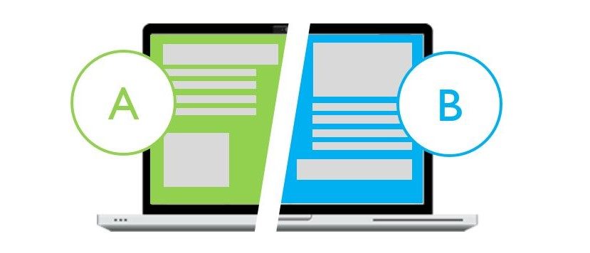
12) A/B testing: test hypotheses rather than random ideas
A/B testing is still vital, but it's not about randomly changing colors and observing outcomes. Instead, the aim is to test a hypothesis based on user feedback or analytics.
A comprehensive testing process:
- Identify the bottleneck: low CTR on CTA, high bounce, form drop-off, cart abandonment.
- Form a hypothesis: "Visitors do not convert because shipping cost is unclear."
- Design a focused variant: add shipping info above the fold, simplify the CTA area, and show price-with-shipping clearly.
- Measure one primary metric: conversion rate for the page's goal.
- Run the test long enough to avoid random noise (especially if traffic is low).
- Document what you learned so future pages improve faster.
A/B testing is most effective when combined with qualitative insights. Testing blindly might lead to a 'win' without understanding why, preventing the development of repeatable improvements.
13) Iterate continuously: the landing page functions as a product.
Repeat testing and consistency create customer-friendly landing pages. Modernize this into a straightforward operational routine.
- Weekly: review landing metrics and session recordings/heatmaps (if you use them).
- Monthly: gather qualitative feedback (support tickets, chat logs, surveys).
- Quarterly: refresh proof assets (testimonials, case studies, photos, updated FAQs).
- Ongoing: maintain performance and avoid script bloat.
Landing pages evolve over time. New objections arise. Competitors change. User expectations shift. If you treat landing pages as "set and forget," conversion rates will gradually decline.
14) A customer-friendly checklist (quick reference)
Use this as a final pass before publishing:
Clarity
- One audience, one goal, one promise
- Headline matches traffic source message
- CTA is obvious and repeated at logical points
Relevance
- The content answers the visitor's main questions
- The page matches the intent (buy vs research vs compare)
Trust
- Proof is specific and visible early
- Pricing, shipping, returns, or terms are transparent
- Contact/support is easy to find
Friction
- Forms are short and explain required fields
- Checkout feels safe and predictable
- No distractions compete with the primary action
Performance
- Fast load and stable layout on mobile
- Scripts and heavy media are minimized
- Page feels responsive and smooth
Optimization
- Hypothesis-driven A/B tests
- Learning documented and applied to future pages
- Continuous iteration based on real feedback
Understanding what "customer-friendly" really means
A customer-friendly landing page is more than just visually appealing. It respects the visitor's time, aligns with their intent, answers their questions, and removes reasons to hesitate. When your landing page does this, conversions become clearer. You stop depending on luck and start using a proven system: research, clarity, proof, reducing friction, and iteration.
Whether you're selling handbags, consultations, or software, the principle remains the same: the best landing pages make visitors feel guided rather than pushed. That’s what converts qualified traffic into measurable results.